What you see is what you can extend in APIs is the mantra I live by while writing my own APIs and when evaluating others’.
In my career as a web developer, I’ve interacted with probably hundreds of APIs, even written a fair few. Through all of that experience, I’ve come to one very specific conclusion about what constitutes “good” even “delightful” API design: Public access is key.
Public vs private APIs
The one marker, for me at least, that makes an API stand out is just how much the actual API code can be extended. That is, how much of the API is public and how much is private? And how much of the public vs private functionality is the API itself using?
Now, obviously, this discussion is heavily focused on FOSS APIs. This is largely because you can literally see and interact with the internals.
When examining public vs private, often the best approach is to consider the rules of the API itself. What constitutes “extendable” and what doesn’t? Does the core use a bunch of stuff hidden behind barriers or can you extend the same code core does? What is the core’s policy on backward compatibility?
Once you’ve set a public vs private baseline, then deciding openness is usually pretty simple. I’ve always felt that open and public should nearly always be preferred. It almost feels a little bit lazy for an API to bake in special goodies for itself then mark it private like it’s unfinished or something.
Examples in practice
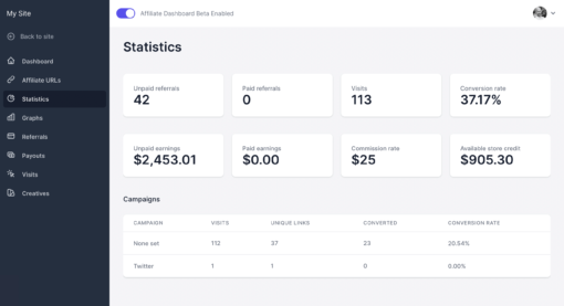
We’re right in the middle of a big project at Sandhills right now. We’re building a new pro add-on for AffiliateWP called Affiliate Dashboard. It introduces a portal-like experience for affiliates, largely intended as a premium replacement for the standard core affiliate area.
The standard affiliate area API is template-based. Themes can override core templates, even introduce custom ones. It’s a very free and open extension environment but also very difficult to enforce high standards in the long term.
On the other hand, Affiliate Dashboard API is control-based. This means first- and third-party developers register display elements through the API and the add-on itself controls rendering them.
At the time of writing, approximately 95% of the add-on dogfoods its own public APIs to render itself. We register views, sections, and controls the exact same way any other developer would. This is in part to prove a point that amazing things are possible, and in part to provide a living example for best practice.
For instance, want to see how we did something, maybe make your own version? The add-on source code is your best, first reference.
To be fair, there’s still a very small percentage of functionality we haven’t yet converted from its MVP form. By the time we ship the 1.0.0 stable in a few weeks, we’ll be entirely rendering on our own public APIs. Pretty sweet!
Delight and deliver
I like to think that we’ve designed the Affiliate Dashboard APIs with an intent to delight and deliver. Within the boundaries of what the API itself allows, what you can see is what you can extend.
Moreover, we’ve gone to great pains to make it feel consistent from control to control. For instance, some controls output very simple things, others do incredibly complex things under the hood like rendering a table using REST and Alpine JS.
The main point is that in trying to delight our extension community, we’ve forced ourselves to think simply when it comes to writing extensions:
- All controls have a similar entry point
- All controls use the same structure of attributes and arguments
- Pretty much all controls support Alpine JS directives
- All controls support a limited set of TailwindCSS classes
This consistency begs the question, “What is the fastest way to get developers from A to B and promise a really high quality result?
After some reflection, I think it’s to write a whole lot of excellent example code that oh hey, by the way, happens to run the add-on itself. Surprise!